Celebrating spectacular typography creations with a visual book & letterpress prints produced by independent makers. Check the project on Kickstarter.
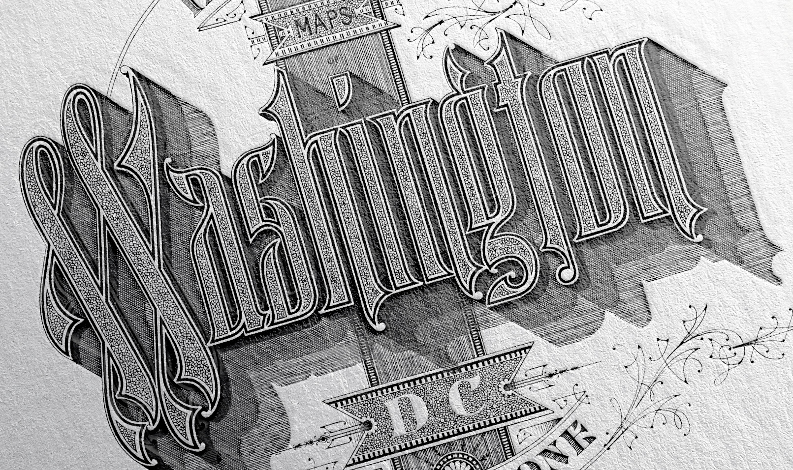
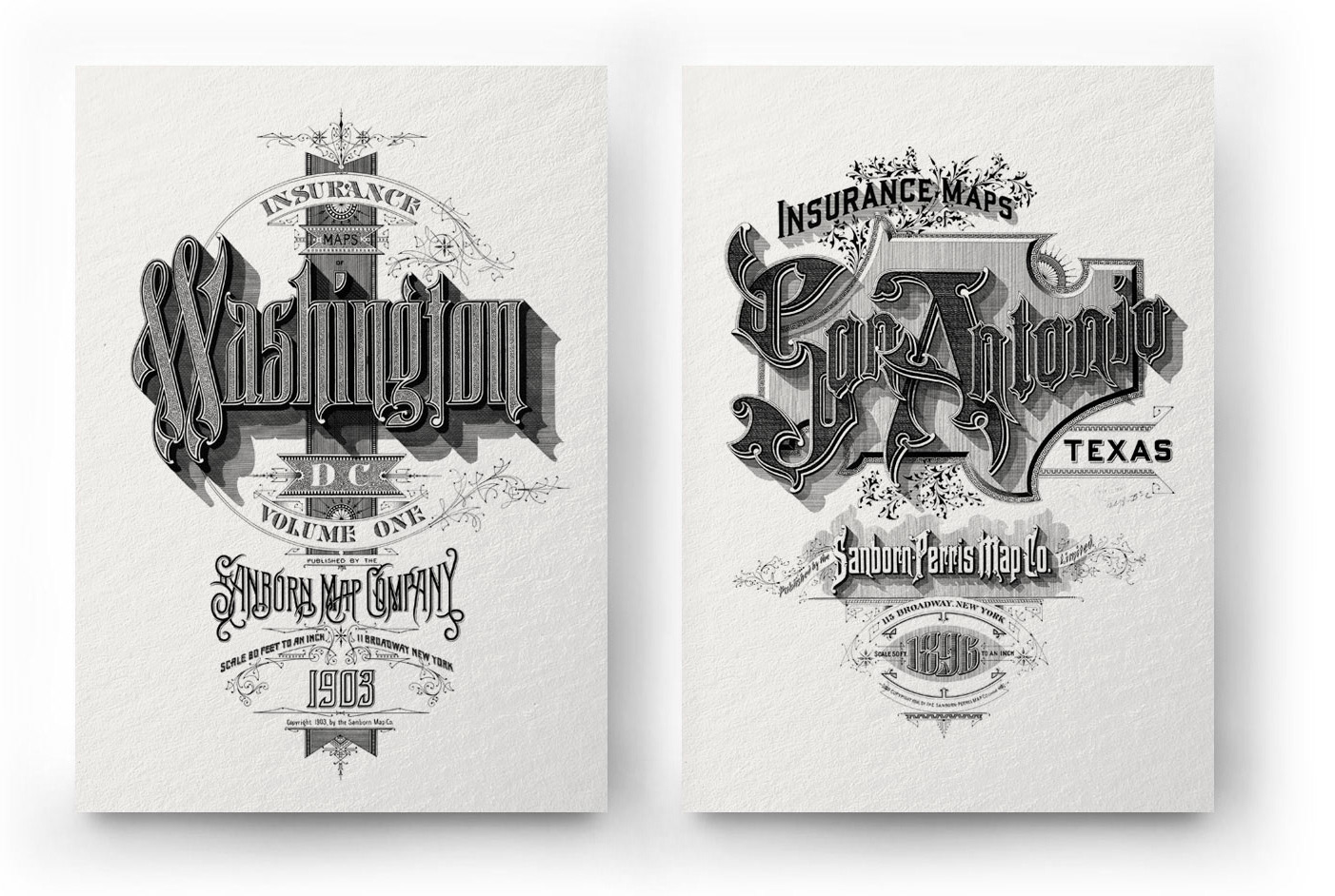
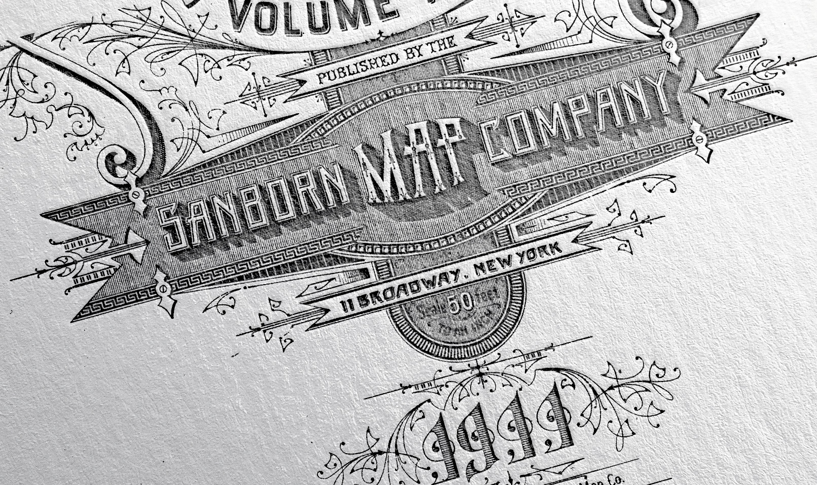
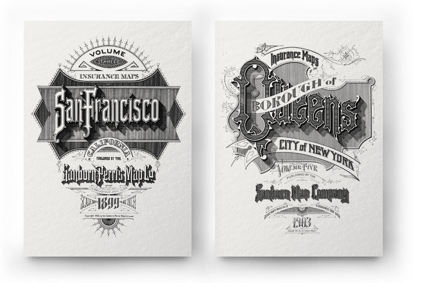
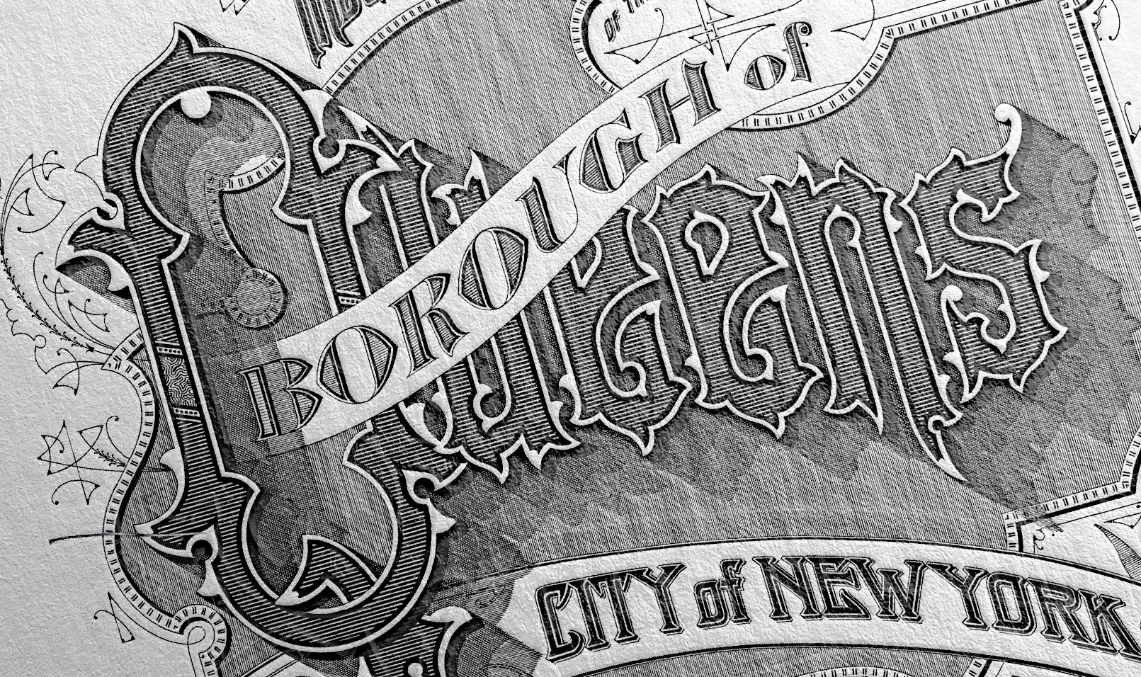
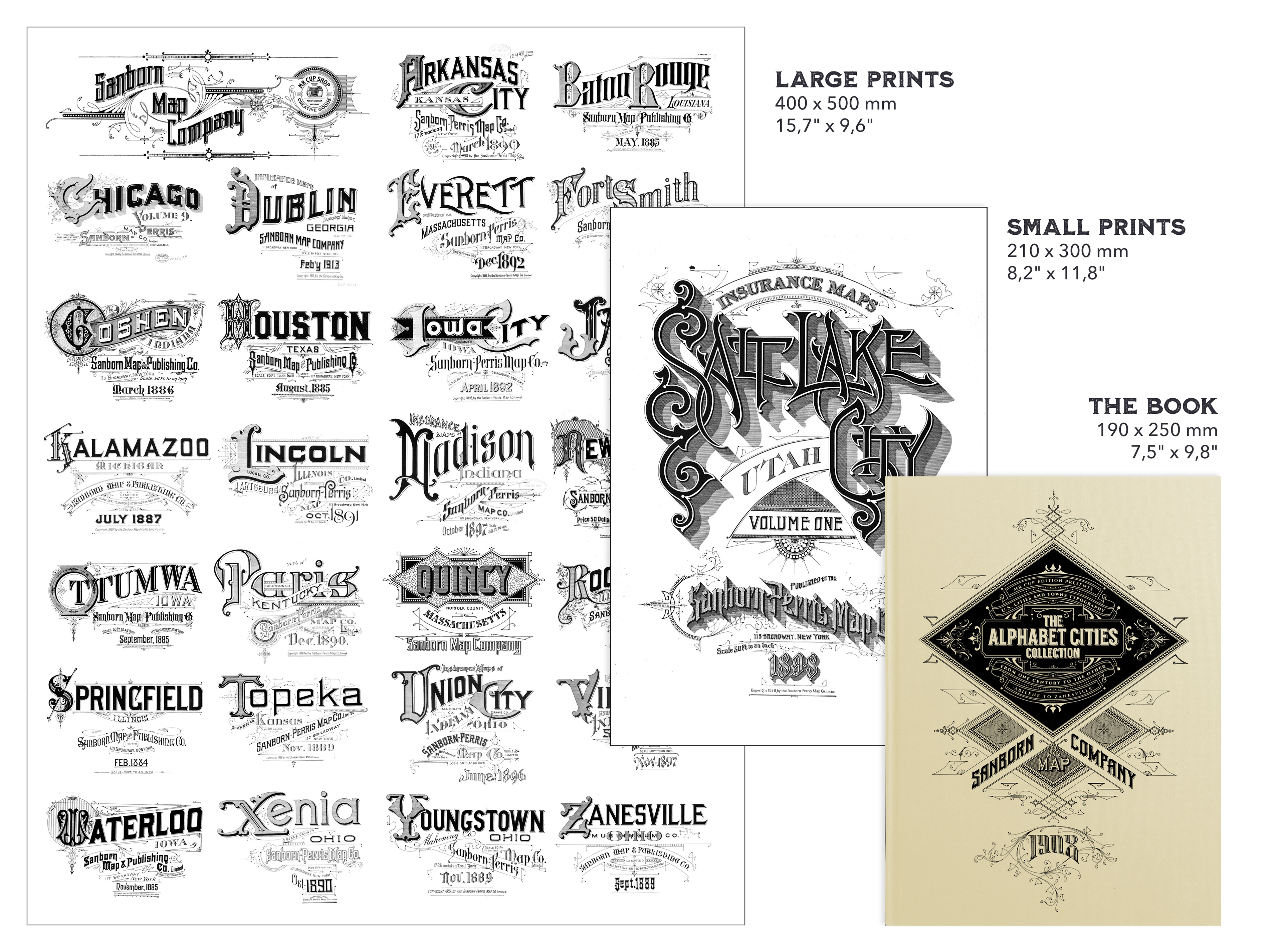
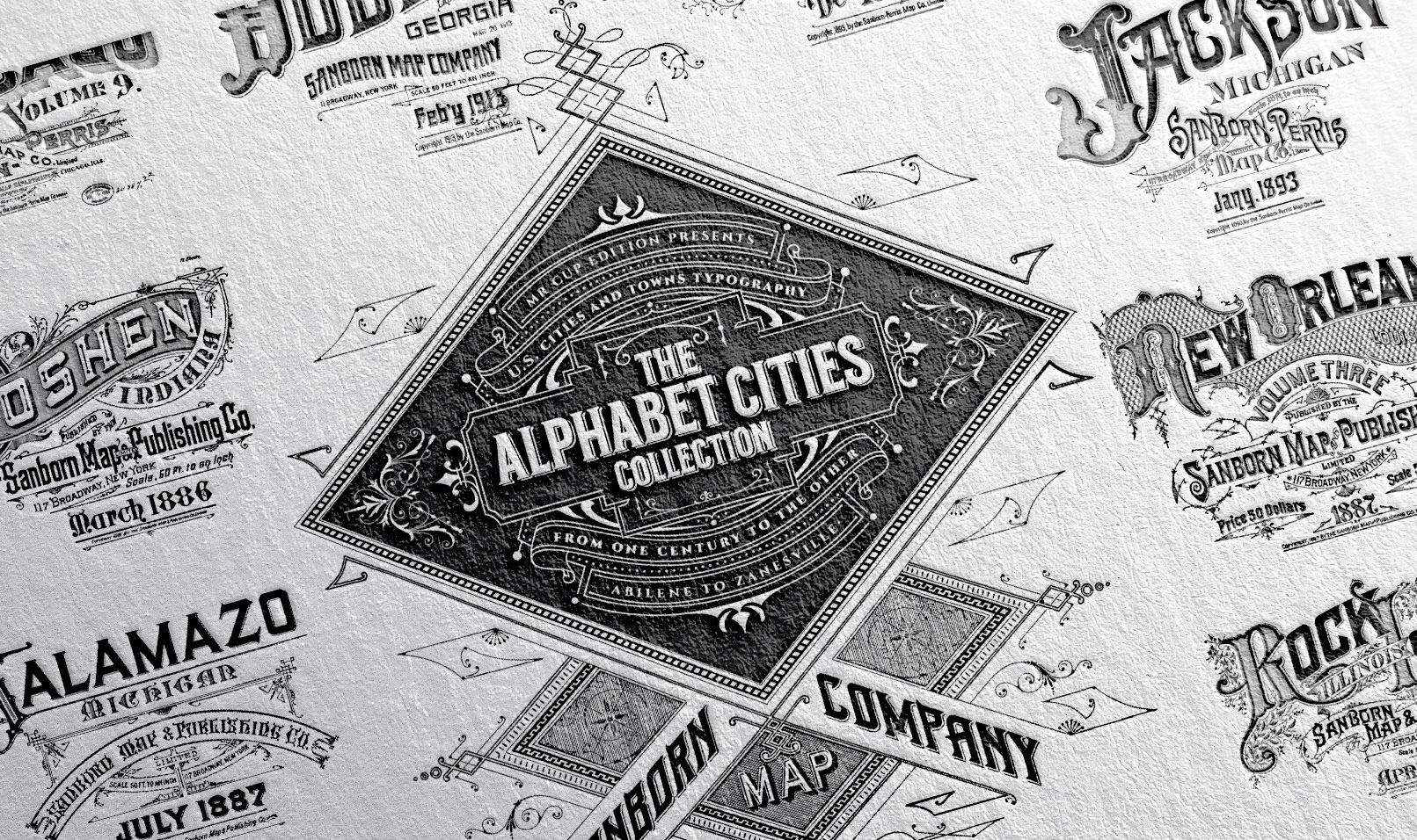
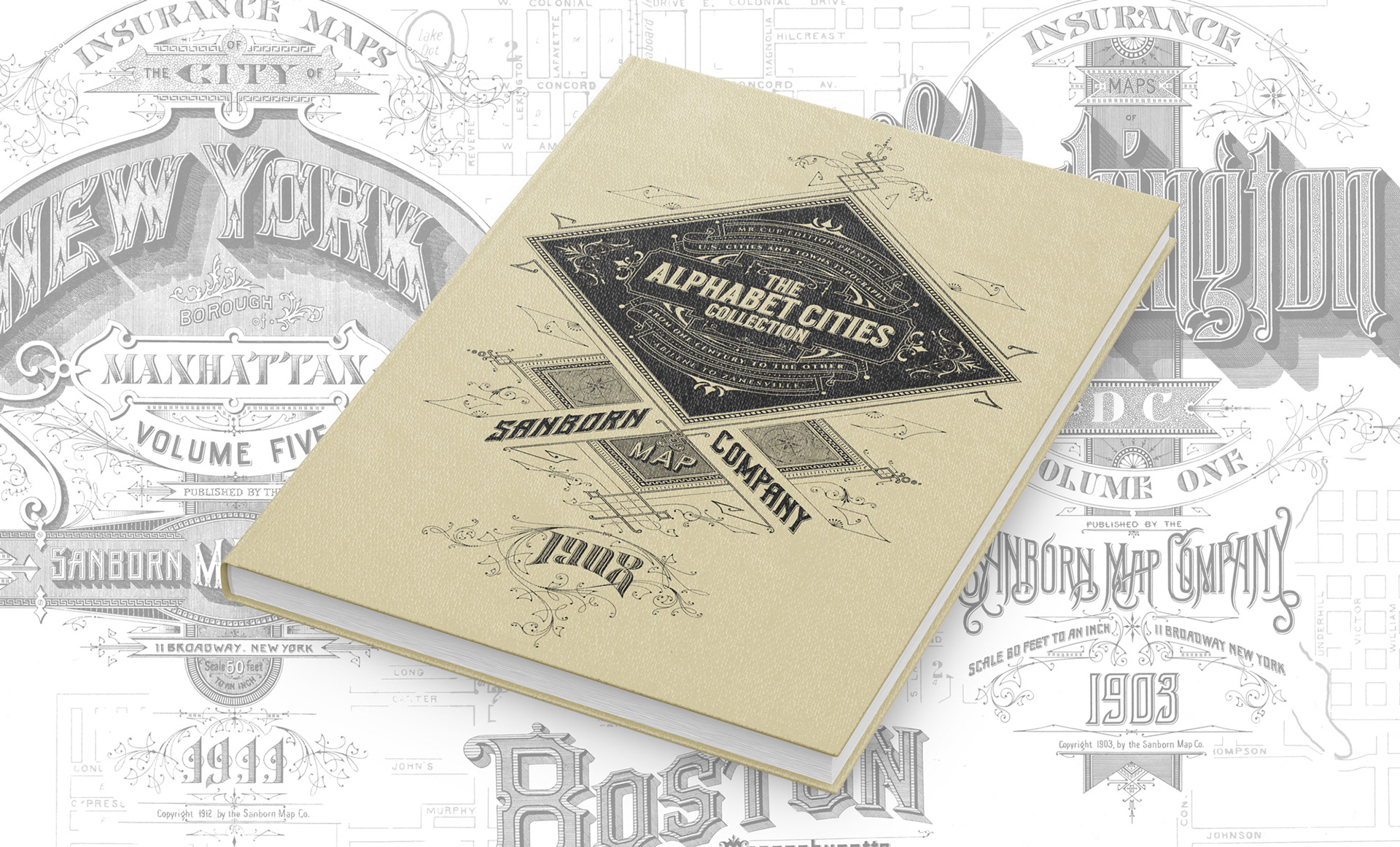
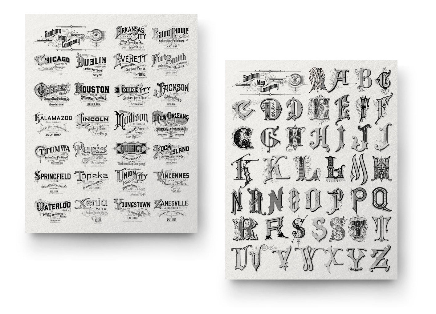
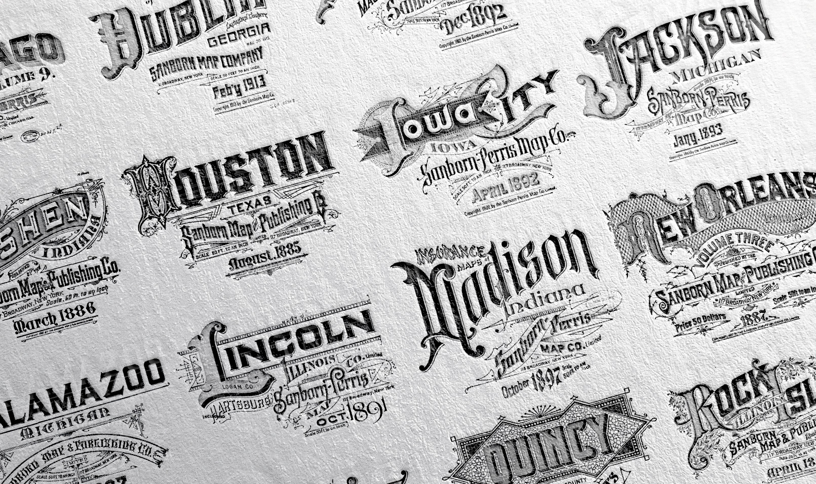
Sanborn Fire Protection Maps were originally created back in the 1860s to assess buildings and homes before insurance companies issued fire protection policies. If they are frequently used by historians for the important information they gave on cities, what always fascinated me about these maps is the typographic work done on each city name. I spend hours documenting all this legacy and order them alphabetically. Passionate by print, I want to give these a new life with letterpress prints and a book. The book will present as many cities typographic names as possible, ordered alphabetically.
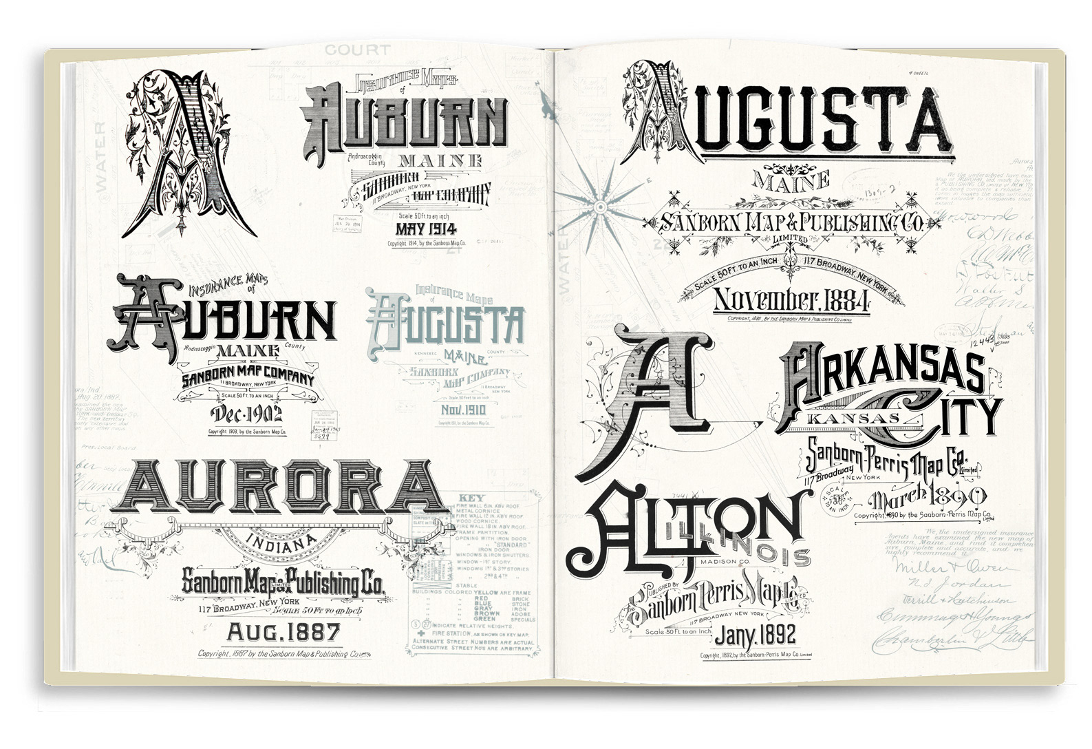
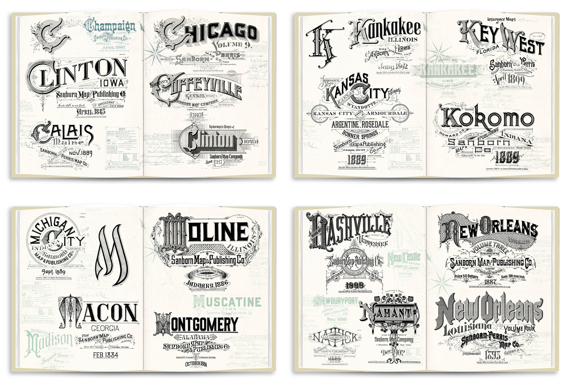
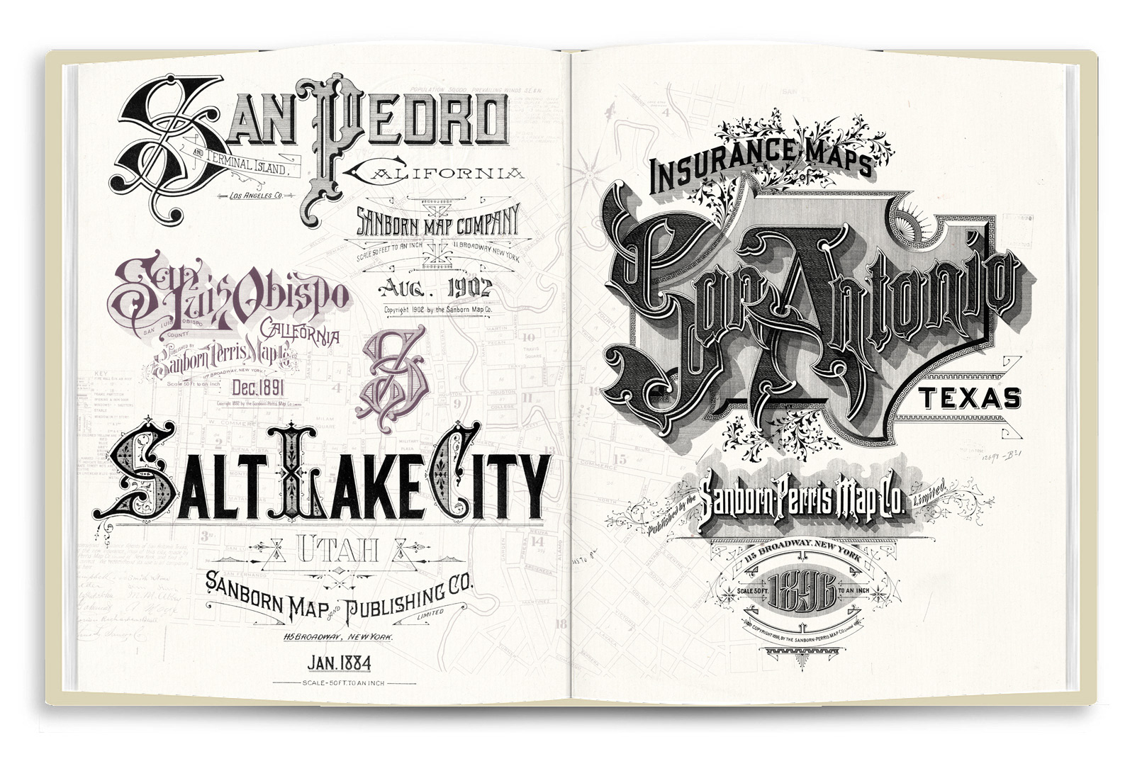
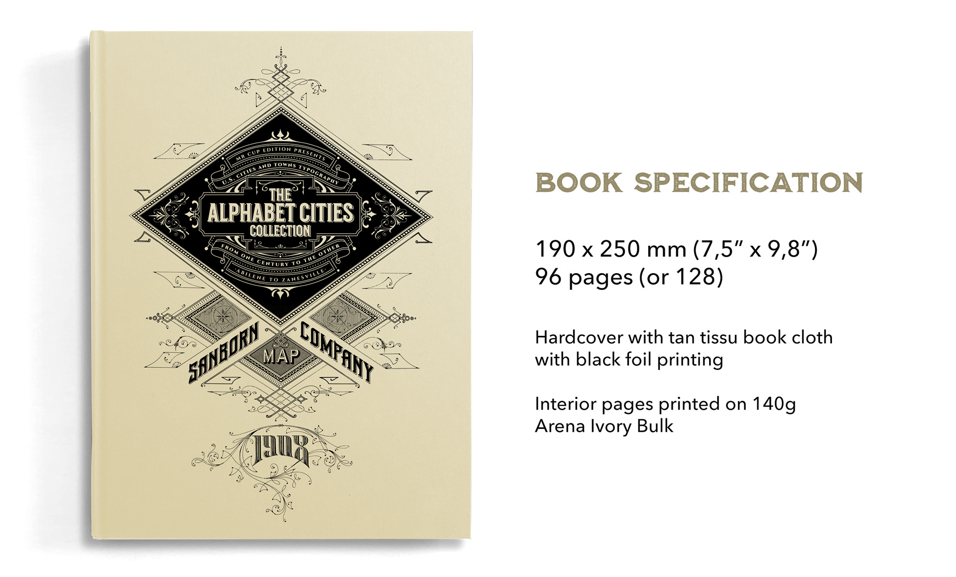
The book will be 96 pages, but depending on the success of the campaign, it could be 128. Some spread will be the large title to show all the details.
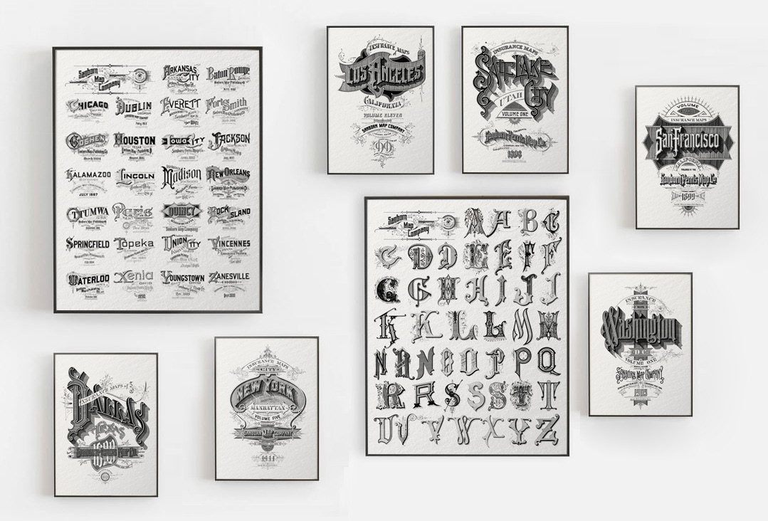
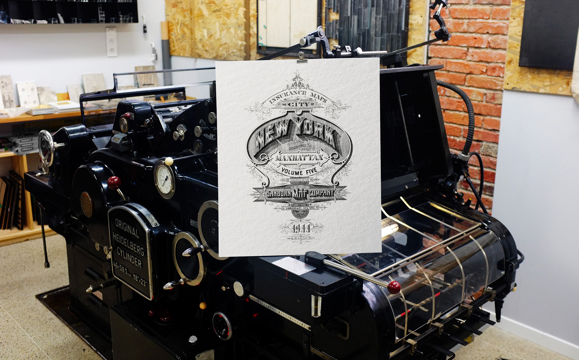
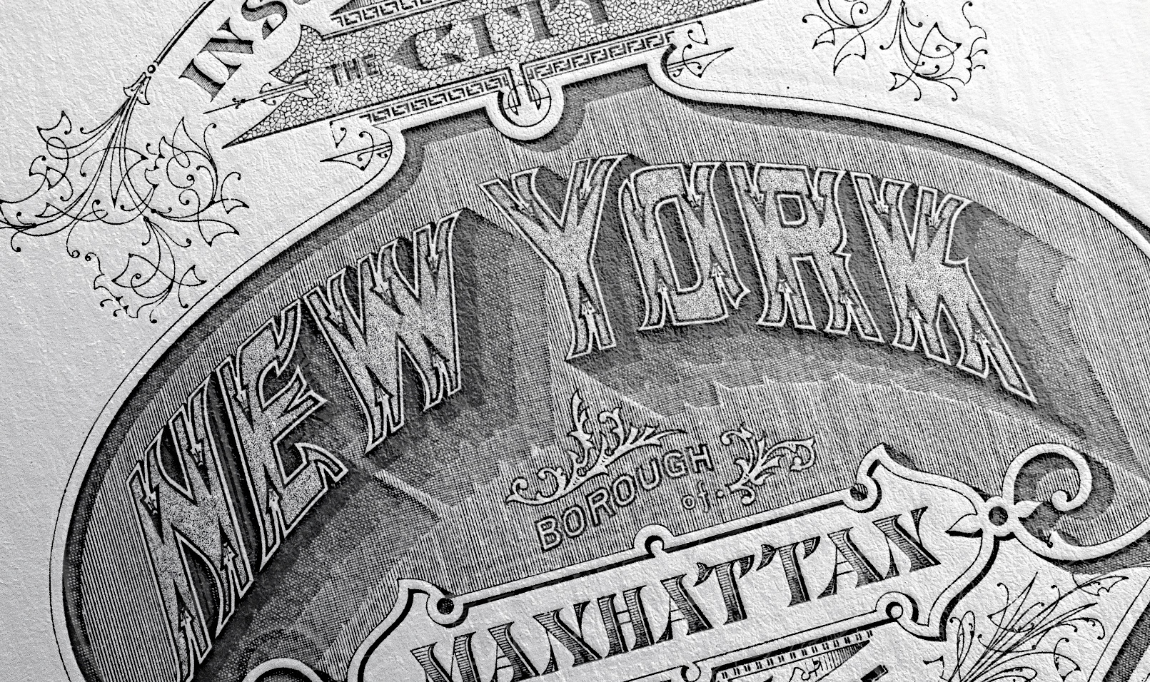
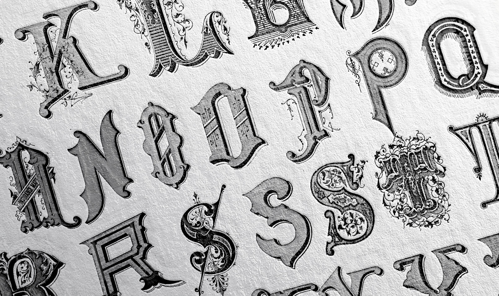
The larges print will be 400 x 500 mm size (15,7"x9,6") and 3 different will be available: the Alphabet, the cities names, and a large print of the New York title.
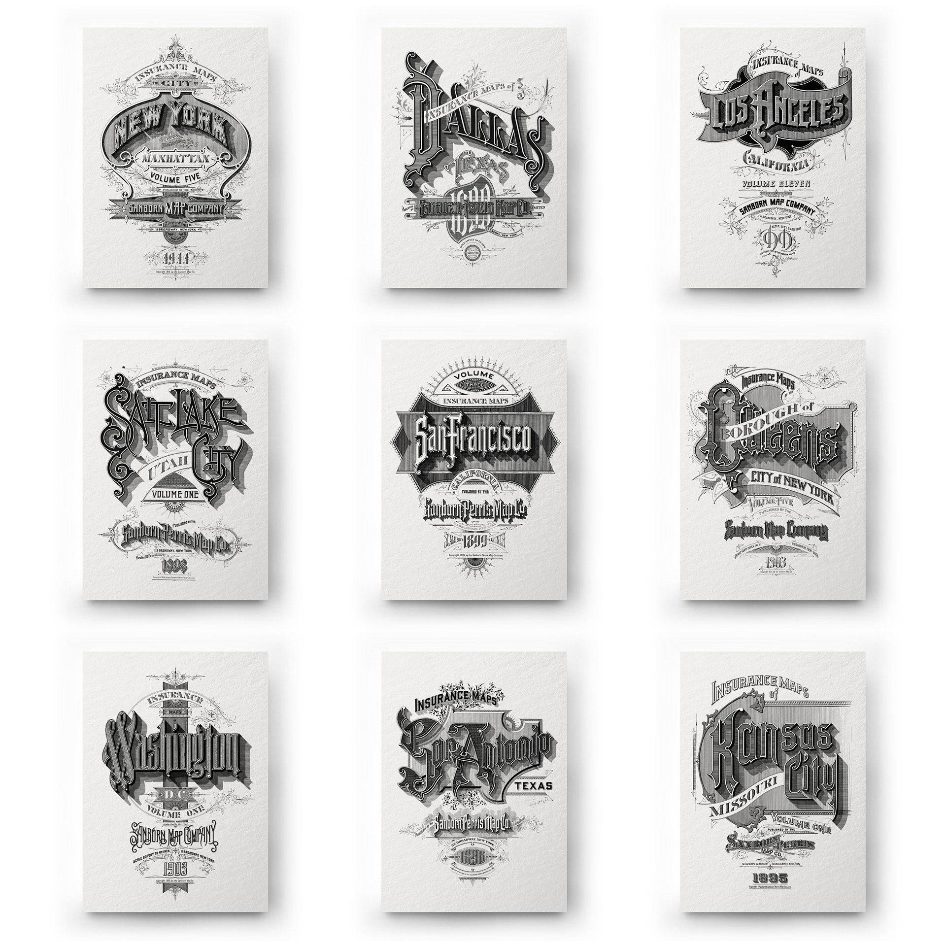
The small print will be 210 x 300 mm size (8,2"x11,8") and dedicated to a selection of cities for their amazing design. There will be 10 different prints: New York (01), Dallas (02), Los Angeles (03), Salt Lake City (04), San Francisco (05), Borough of Queens (06), Washington (07), San Antonio (08), Kansa City (09) and Providence (10).